tyler, the creator poster
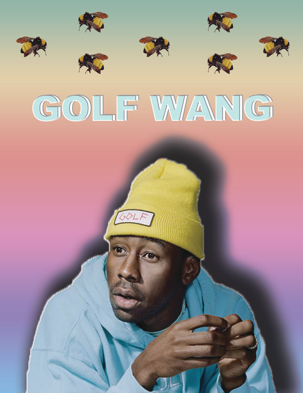
This was our 'demo' edit for using Photoshop. We were allowed to choose any picture of a famous person we like. First, I opened the picture of I liked of Tyler, The Creator onto Photoshop. I then used the Quick Selection tool to select the part of the image I wanted. I then pasted Tyler, the Creator onto a new document (11 x 8.5, CMYK). We were shown how to add a background, use the gradients, text, and add symbols/images in. I played around with the background until I found a gradient that complimented his colours well. Then. I added the text 'Golf Wang' (Tyler, The Creator's company) at the top. I used two layers of the text, one in a green/blue and the other in white. For the green/blue text, I just added a greyish drop shadow and a white inner shadow. For the white text, I also added a greyish drop shadow. To complete the poster, I added Tyler's 'Save the Bees' bees at the top, a total of 7 in an alternating pattern formation.
zach galifianakis edit
before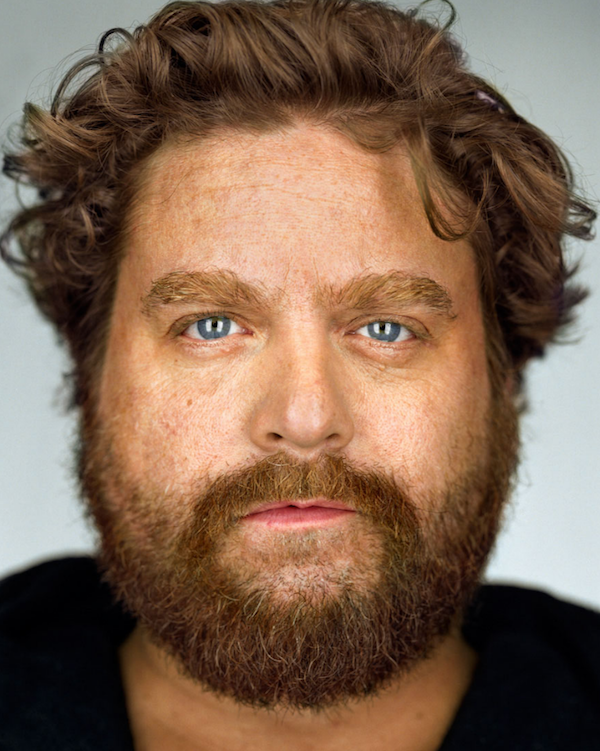
|
after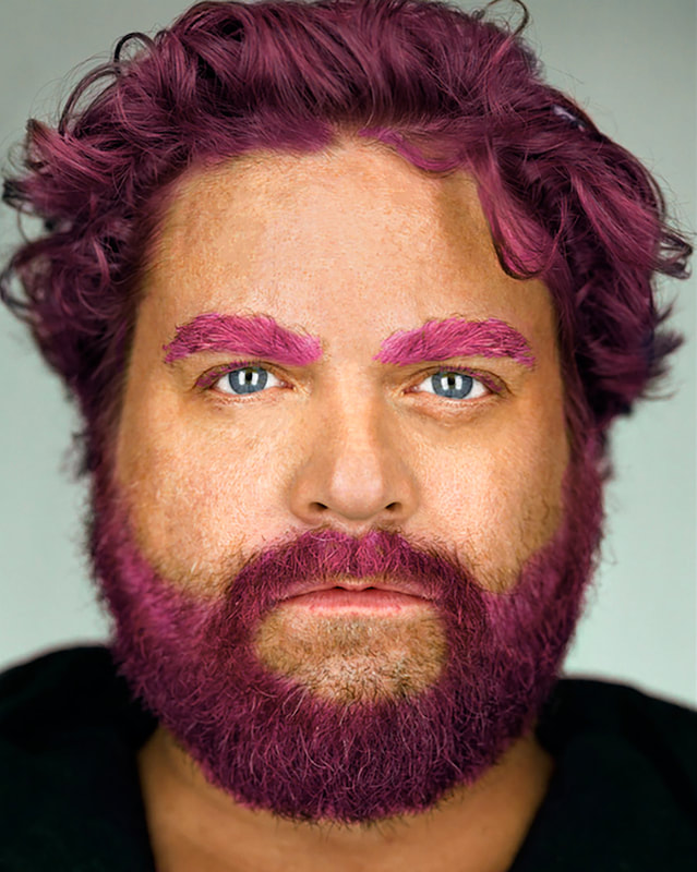
|
For our second project in Photoshop, we had to choose between George Clooney and Zach Galifianakis to edit. Kadence & I decided to pick Zach as our edit. We learned how to use different brushes, but mostly importantly, the mask. First, I removed any spots or blemishes to his face with the spot removal tool. Then, I removed any aging lines (between eyebrows, under eyes, etc.) with spot remove brush and the healing brush. I worked a little bit on his eyes by going over the whites (highlight) of his eyes and the perimeter of his eyes using some darker tints, by increasing/decreasing the exposure. Lastly, I turned the colour of his hair to a purple-ish pink. I did this using the overlay mask, then erased the areas which contained his skin. This is what gave the effect of the 'purple hair'.
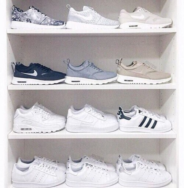
shoe ad inspo
|
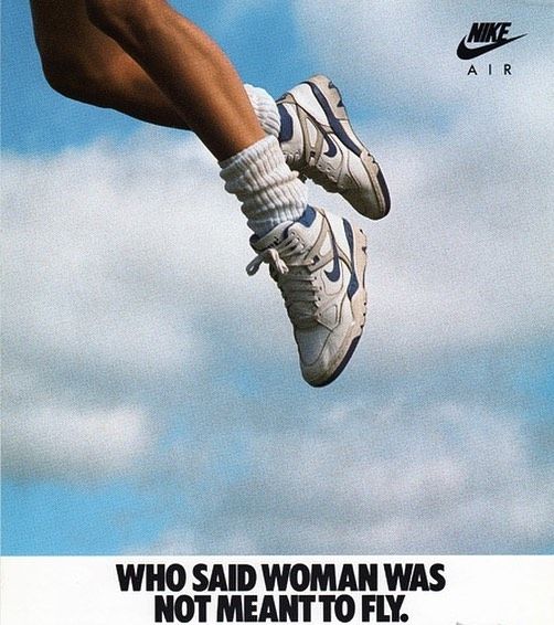
|
|
nike shoe ad
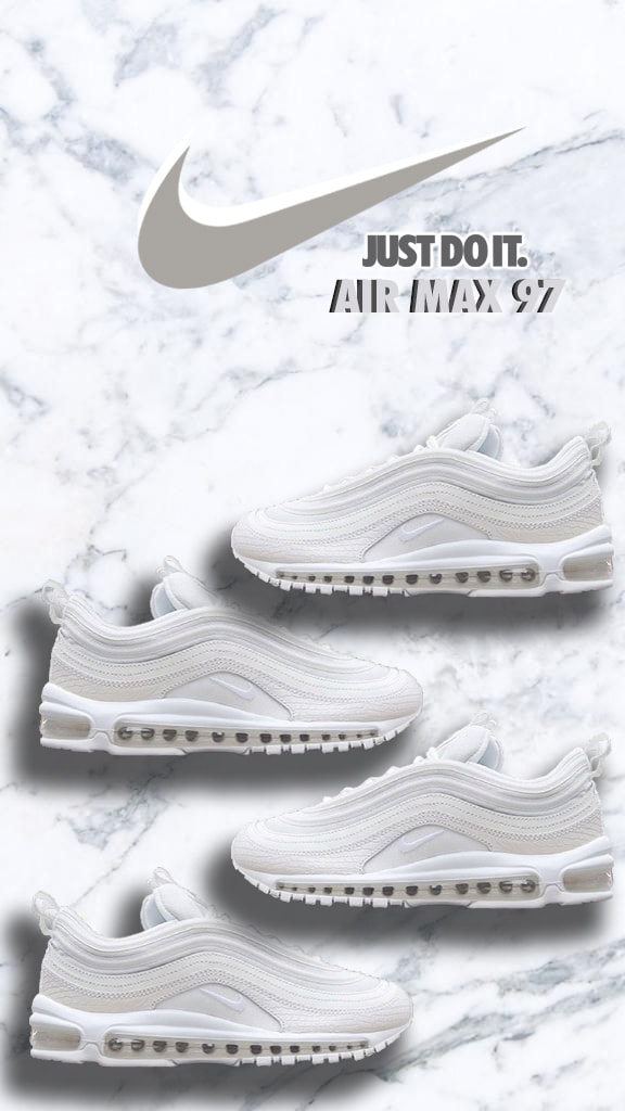
I was inspired to create more of an 'aesthetic' poster, using the shot of my friend's White Nike Air Max 97's. I first grabbed a marble background off of the internet that I liked the most. Then, I imported the picture of the shoe and used the lasso tool to select just the shoe. I had to zoom in a lot to get really fine detail. Next, I played around with using different effects on the shoe, but I finally chose to just add a drop shadow to make it look like the shoe is floating (since it's AIR Max). I used 4 shoes in total, having 2 on each side face each other, like they were stacked on a wall in the store. Staying in the marble colour scheme, I used a Nike symbol from the internet to put at the top. Importing it the same way as I did with the shoe, I copied the Nike symbol, made one white and the other grey. I used the eyedropper tool to select a grey from the marble. I added the famous Nike slogan, 'Just Do It.', to the top, along with the shoe name, 'Air Max 97's'. For the 'Just Do It' slogan, I added an outer glow of white. For the 'Air Max 97's', I copied it and used the second one behind it, in a darker grey-black colour. Overall, the poster met my expectations of the 'aesthetic-ness' of it; I am very pleased.
self-portrait poster
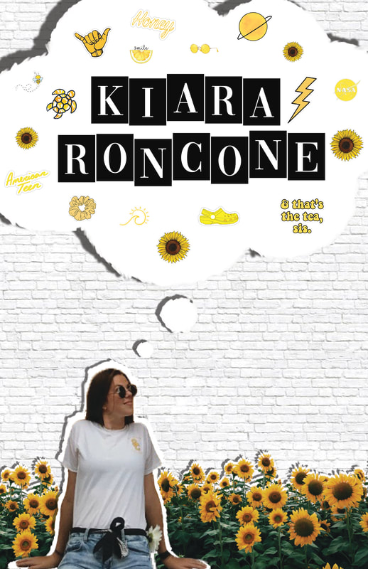
I was inspired to recreate the posters that some of Mrs. Owchar's previous students have made. It included the 'cut-out' letters of the person's name, the person and a theme. Sticking with the 'aesthetic' theme of things, I decide to take a picture of myself that my friend took of me in the summer. Going with the theme of yellow, I used a field of sunflowers to place behind me on the poster, so that it gave the illusion I was sitting in the field of sunflowers. Behind the sunflowers, I copied it and did a colour overlay of white. For myself, I also copied it and gave it an overlay of white. I then used the smudge and lasso tool to give it the effect like it's been ripped out of a book. Continuing with this style, I added it to a giant thought bubble I put above my head. I finished the poster by adding a white brick background and filling the thought bubble with yellow hydro-flask stickers.
